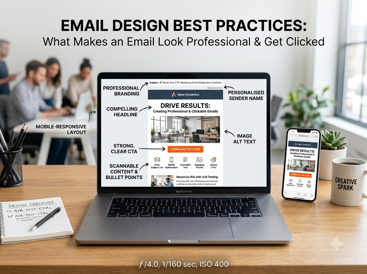
A Guide to Design Effective Marketing Emails
If you check your email daily, you will find dozens of promotional emails sitting in your inbox or in the “Promotions” tab. But do you read them all? Probably not. You skip most of them because, within a few seconds of opening emails, you determine whether they look professional, trustworthy and worth your time.
Your target audience does the exact same thing. They are already frustrated by receiving so many emails, and getting them to open your email is only the first step. The real challenge is getting them to stay and read your email.
That’s where most businesses fail. We have seen that even great email copy gets ignored because it lacks great design. Indeed, an attractive subject line will increase open rates, but it is the great email design that earns the read and trust that makes the click possible. Your email design decides if anyone stays long enough to read it. Without it, your email copy will not get a chance.
This guide helps you design professional-looking marketing emails that resonate with your audience and help you reach your goals.
Begin with a Master Template
Start with a well-designed email template that you can reuse and customise every time instead of creating an email from scratch. Your master template should include all the essential elements such as your logo/header, brand colour and font, content structure, image placement, button/link style and footer/contact information.
But a master template is only effective when it is built with professional HTML email design. This helps the email render correctly across different email clients, whether readers open it in Gmail or Outlook. Also, you don’t create an email from scratch every time; simply change the headline, offer, images, text and button while keeping the overall design the same.
Plan Your CTAs
Marketers send an email with a motive, and the CTA in the email is what makes that motive happen. It is not just a button; it’s the next step you want your readers to take. A weak CTA button is why businesses get opens but no clicks. It is essential for every email, and its placement is equally crucial. To make your email get clicked, follow this:
- Keep it concise and clear: Your readers should know exactly what will happen if they click. Do not use generic buttons like “Click Here” or “Learn More”. But use direct, action-driven buttons like “Buy Now”, “Download Guide” or “Shop Now”.
- Make it noticeable: You want the audience to take action, but what if the action button gets lost among other content? It will never let you reach your desired result. Hence, make the CTA stand out and give subscribers a clear reason to click on the link.
- Place it with intention: Marketers often place the primary action button at the top of an email so it’s easy to find. Sometimes people need a bit more info before they click. So, place the button right after you explain your offer, not at the very top.
- Try different options: Don’t just guess what will work for your email and get you more clicks; try different versions. Change the words, colours and where the button sits. Send this to two different groups. Within a few hours, you will know which one people like more.
Optimise for Phone
Since most people use mobile phones, it is essential to make your email mobile-friendly because if people cannot open emails on their phones, they will probably delete them. Here’s what most marketers do to make their email design phone-friendly:
- Use a template that works on a phone: Your email template should automatically fit any screen size. For example, if an image is displayed next to the text on a desktop, the same image will display below or above the text on a mobile device. This keeps your text readable and images visible without anyone needing to zoom in and out.
- Keep subject lines short: On a mobile screen, people can typically see a subject line’s first 33 to 43 characters. So, you should keep your email’s subject line under 35 characters. These characters should show why a customer should open your email. It should emphasise the problems you are addressing. If it’s a reply to the email they sent you, make sure you mention it clearly in the subject line so the recipient knows it is the answer they are waiting for.
- Use mobile-friendly formatting: Phones have narrow screens. Keep it in one column that makes scrolling easier for users. It allows them to skim the content and find what they want. Most marketers set the body text to 16 pixels. These are important, especially for long emails.
- Links should be large and set apart. If you have used different links, people using their thumbs might tap the wrong one. Give enough space between each link. Create large, thumb-friendly buttons so people can click on the link without tapping anywhere else.
Personalise Your Content
Stop sending the same email to everyone because it never works. You get better open rates when you use someone’s name and address their current situation or problem. For example, “You left this in your cart” works way better than “Check out our new collection”. A personalised email performs far better than a generic email. People read and click when they feel the email is written for them. If they find it an email blast, they delete it.
So, add a personal touch to your message and get a chance to connect with your readers on a deeper level. For personalisation, you will have to segment your audience to understand who they are, what they like or what they have bought before. This helps you include the content in your email that matters to each group. Begin the email by greeting the recipient (using their first name), mention their interest/problem and recommend with care.
Show Your Brand’s Character through Design
Your email design should reflect your brand’s personality. It is essential to make your email look good, but it is even more important to make it look like you. So your readers can recognise your brand at a glance. The style, font, colour and overall look of your email should feel like your brand and not generic.
Here’s what you can do:
- Make sure you use the same font, colour, logo and other marketing material in your email as you use on your website.
- Use professional-quality images that support your messages and match your website's standards. This makes your email look better.
- Don’t write the entire message in a long block of text, nor use too many images. Utilise white space to create a neat and clear layout that not only makes your email look better but also makes it easier to read.
Include an Unsubscribe Link
We understand you want your audience to stay, but forcing them to stay will hurt you more. People will leave, so let them. Keep your unsubscribe link easy to find. It’s important because if someone wants to leave but cannot find the unsubscribe link, they can simply mark it as spam. This is way worse than an unsubscribe.
Including an unsubscribe link in your email is not only a good practice but also a legal requirement. If you make it easy to leave, people trust you more. Just make sure the unsubscribe button is clearly visible. This openness builds trust, and the audience sees your brand in a better way.
Make Emails Accessible for Everyone
Make content accessible to everyone, regardless of ability, so they can read and use it on different devices. It is important because your emails reach a wide audience, and not everyone experiences emails the same way. Some people have difficulty distinguishing between two colours, or they cannot read text in certain font styles and sizes. So, you must design emails with accessibility in mind because this ensures that more people can get your message. Keep it simple and make your email accessible for everyone.
- Make it readable: Skip the small, fancy fonts. They might look cute, but no one can actually read them, especially on phones. Just use a normal font or the same font your website uses, make it big enough and leave some space between lines.
- Add descriptions to images: Don’t include major information in images in your email without adding a description. A person who cannot see an image can never know its contents. Adding a description will still convey the image's message to a person using a screen reader.
- Use good colour contrast: There should be enough contrast between your text and background colour. Avoid using colour combinations that make your text difficult to read, for example, light grey text on a white background.
Make Emails Look Good in Both Dark and Light Modes
More and more people read emails in dark mode. If you don’t test your email for it, your black logo and dark text can completely disappear. While designing your emails, you must ensure they are readable and look appealing regardless of the recipient’s display settings. Before sending, check that text, images, logos, links and buttons are clearly visible in both modes.
Use Preheader Text
Most people write a great subject line and completely ignore the preheader text. It is the grey text you see next to the subject line in your inbox. If you don’t write it, Gmail pulls the exact first line from your email content, which is usually worthless. So, you will waste the free space. Many marketers use the same preheader text as the subject line. But you should not do it. This space tells the reader what the email is about and helps them decide whether to open it. Although it is small, it makes a big difference in open rates. Keep it under 90 characters, but make sure it's useful.
Conduct A/B Testing
We have seen many business officials spending hours debating whether the button should say “Buy Now” or “Shop Now”. We suggest keeping both. Yes, you can send both to a small list and see which gets more clicks. Don’t just assume what will work. Just try and see it yourself.
For this, you don’t need any fancy tools. Try with your subject line, preheader, CTA or image. Send version A to 15% of your list and version B to another 15%. Check which one got you more clicks and send the same to the rest of your email list. You never know what works better until you try. Start simple, test one thing per email and you will see what works best for your email marketing.
Common Email Design Mistakes That Kill Clicks
We have audited many email designs and found almost the same problem everywhere. You will kill clicks if you are making the same common mistakes:
3 to 4 Fonts in One Email
To make your email look attractive, you use 3 to 4 fonts. But it makes your email look messy, like you have copied and pasted the text from different places. Keep your text readable by using one font that matches your website’s font. Or you can keep one font for the heading and one for the email body. Use a maximum of two—no more than that. This will make your email look 10 times more professional.
Entire Message in One Image
Again, to make an email look attractive, you may try to use only one image to convey your message or offer to your audience. But it is not necessary for the image to load properly in everyone’s inbox. Some recipients may not be able to see your message. Even screen readers will not be able to fetch information that exists only inside an image. Your real offers should always be in text. Your image should support your text, not replace it.
Too Many Buttons to Click On
You provide a CTA button to guide your readers to take the next step. But if you use too many CTAs, your audience will get confused about what to click. When you give multiple options, your audience chooses none of them. One email should have one goal. Keep one main button. But if you really need to add another link, you can do this by adding a text link at the bottom.
Email Has No White Space At All
If you don't leave enough space between your text and images in an email, it will look messy. Just leave some space between sections. It makes the content look clean and clear. Readers can skim faster, and they are way more likely to click on your button.
Conclusion
A great email design is not about making it look pretty. It is about making it simple for someone to read and click. When you fix your email design template, check it on a phone, keep the fonts and colour matching your website and provide the right button, you make your email look professional, which gets you more clicks.
Ready to send campaigns that convert?
Try ASP OL Media free for 14 days — no credit card required.